
UX DESIGN | 2024
Designing a mobile layout for course planning on-the-go @ UofR.
I was the sole designer responsible for the mobile layout of melcourses.com, a live academic planning website created for University of Rochester students.
The new layout drove adoption to 500+ students, increasing peak monthly active users from 13% to 20% of the UofR undergraduate population, and helped Melcourses earn official University endorsement.
ORGANIZATION
Roclab Student Developers
ROLE
UX Designer
TEAM
4 Designers
6 Developers
1 PM
TIMELINE
Sep - Nov 2024
CONTEXT
UofR's course registration and planning system, Workday, is confusing
No back buttons
Irrelevant search results dating back to 1968
10+ clicks just to search up one class
It was so difficult that the University had to release a manual on how to navigate it.
CONTEXT
Students create Melcourses
Melcourses scrapes live class data and presents it in a more usable way, letting students search for courses and create schedule plans.
The site launched to 900+ students for Spring 2024 course registration.
PROBLEM
Melcourses needs mobile
When we reconvened in Fall 2024, we met to align on product direction for the new sprint.
5 feedback form responses, corroborated by word-of-mouth feedback from peers, revealed a pattern. Students often share schedules with friends before registration, but with no mobile layout, students couldn't easily compare schedules on their phones. Some students even preferred Workday because it has a mobile layout.
Students needed a mobile layout to quickly view and share schedules away from their laptops. I led the design of this mobile experience.
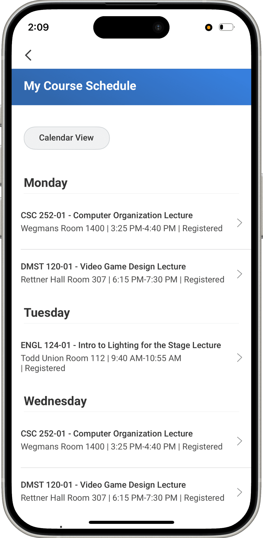
“I just take screenshots of my schedule so I can pull it up on my phone later.”
How might we create a mobile experience that makes finding courses, sharing plans, and editing schedules convenient for university students on the go?
+
+
+
+
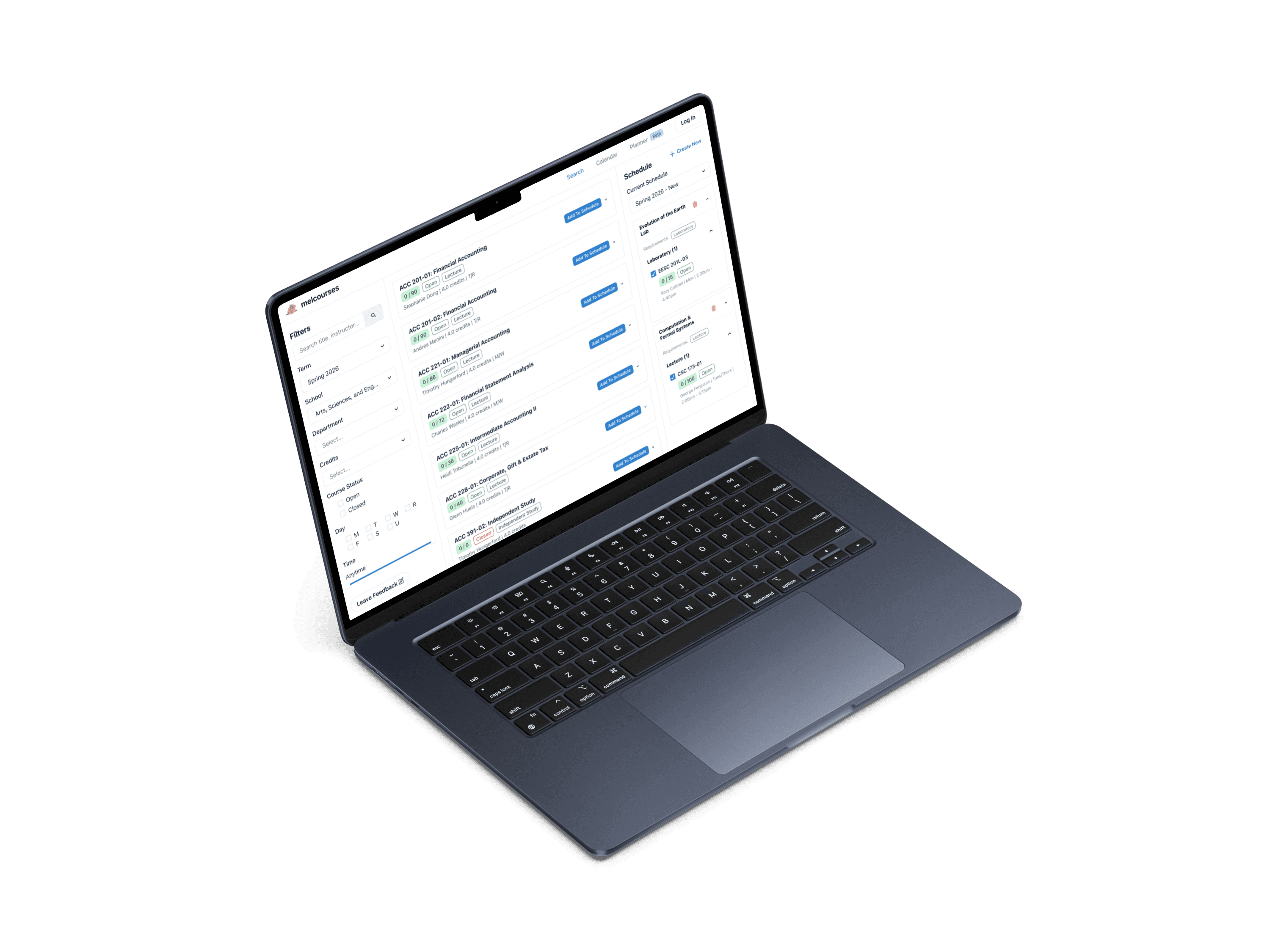
ORIGINAL DESIGN
Search page
To start, I reviewed the desktop experience.
Search page - users read about courses and choose which to take
Left sidebar - search bar and filters
Right sidebar - user's added courses
With limited space, which information would I prioritize?

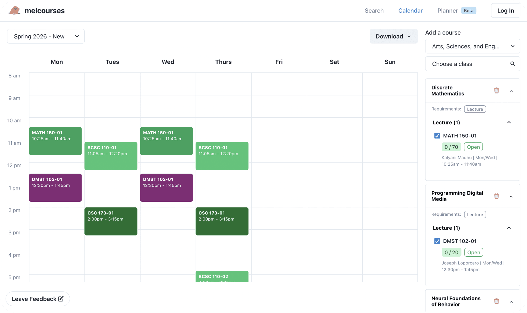
ORIGINAL DESIGN
Schedule page
Users can view and edit multiple schedules
Right sidebar - user's added courses, lets users select different sections (lecture, lab, etc.)
Where would users switch sections on a small screen?
What do typical calendar mobile layouts look like?
COMPETITIVE ANALYSIS
Workday isn't optimized for sharing & comparing
First, I reviewed Workday to identify areas for improvement.
Users wanted convenience in sharing their schedules. However,
Workday defaults to a list view, which isn't visually scannable when comparing at a glance.
Students who want to compare schedules visually need 1 extra click to reach the calendar view.
List View
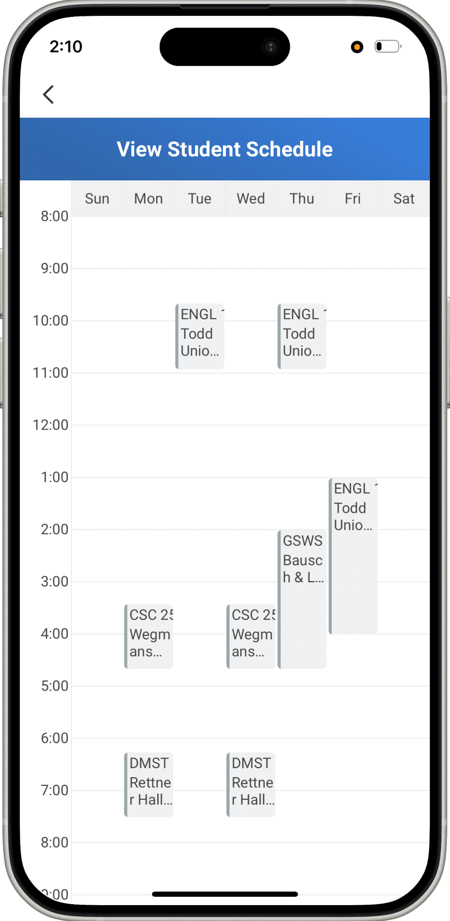
Calendar View

COMPETITIVE ANALYSIS
Swipeable Drawer Pattern
Next, I looked at mobile calendar conventions across Google Calendar, Apple Calendar, and Calendly.
What stood out to me the most was how Google Calendar used a swipeable drawer to handle limited space. When editing event details, users can swipe the drawer down to see the rest of their schedule without breaking the flow.
After I gathered these initial thoughts, something unexpected happened.
I was originally told I had a month to iterate & test, but registration was earlier than expected, and the timeline was cut down to just 2 weeks. I needed to move fast to leave room for testing.
I shared early ideas in our team chat, but the thread quickly exploded. It became clear that
Developers had feasibility constraints and preferred reusing existing web components to ship on time.
Design team, PM, and developers had opposing ideas about layout and navigation.
Rapid Exploration
Instead of trying to juggle these compromises and imagine the perfect design from the start, I decided to act rather than wait.
My approach was to create many variations, from page structures, to navigation patterns, to flows. Rather than acting as the middleman in long debates, I scheduled a single meeting where stakeholders could evaluate tradeoffs and decide on the best elements from my iterations.
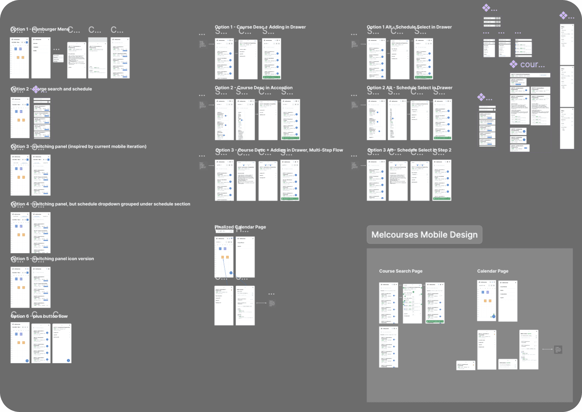
Next, I’ll show a closer look at a few of these iterations.
EXPLORATION
Navigation Options
I explored five navigation patterns to see how they affected task flow and vertical space. The team aligned on the icon-header pattern from Option 4 because it minimized clicks without taking up too much space.

Option 1 - Navigate through hamburger menu
Option 2 - Combine two pages, search bar on schedule page
Option 3 - Tab switch navigation
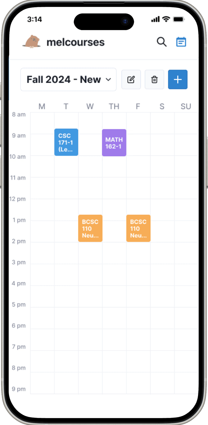
Option 4 - Icon header navigation

Option 5 - Search page is a drawer that pops up over schedule page
ITERATION 01
Page Layout
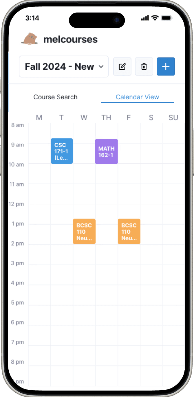
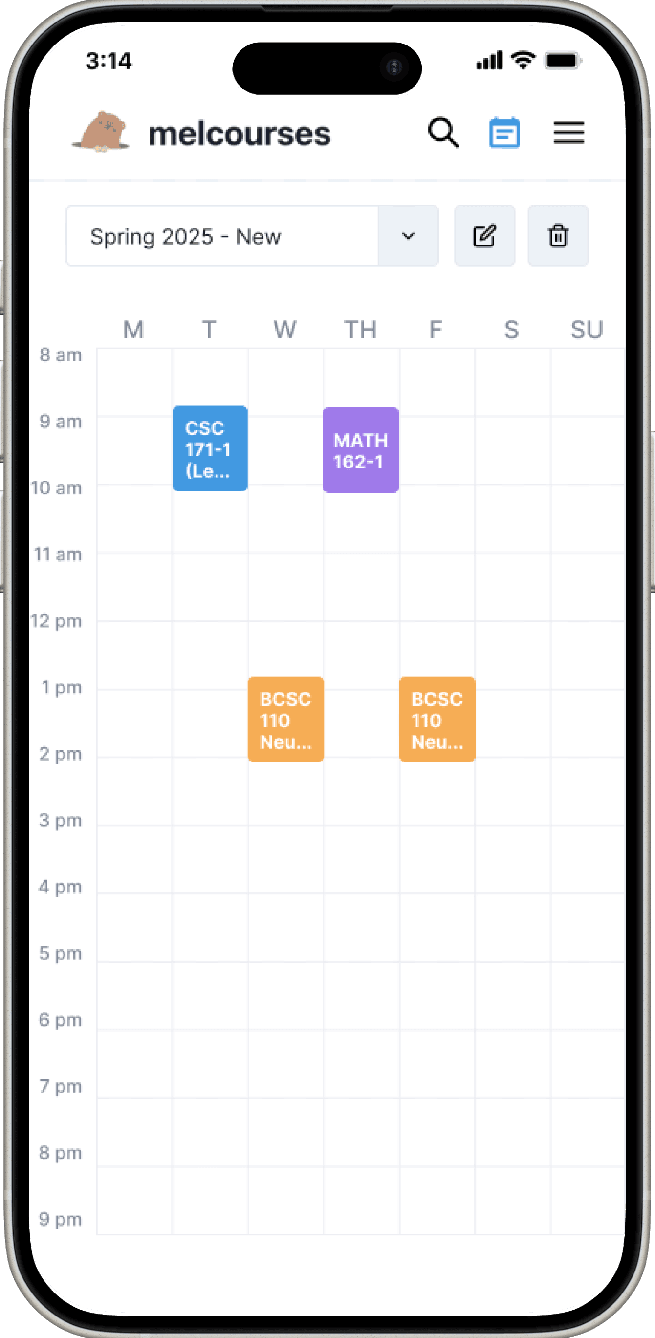
On both screens, I moved the schedule selector dropdown to the top. Users build multiple schedules at once, so I kept the active schedule visible at all times.
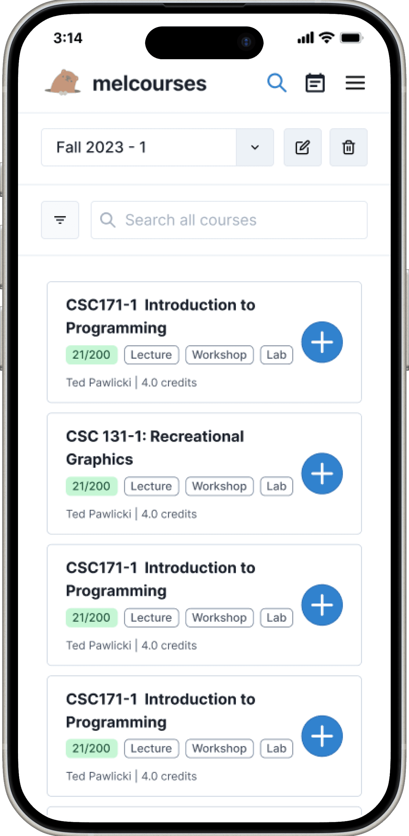
Search page
Course cards are the main view, as the main goal is discovering courses
Search bar moved to the top
Filters nested under an icon to provide further control without clutter
Schedule page
Calendar view prioritized for easy sharing and comparison (unlike Workday)
Classes can be tapped to edit sections directly

ITERATION 01
Issue with schedule selector on search page
After the team reviewed these designs, they found an issue.
Bon (PM)

Users might miss selecting a schedule first on the Search screen. They’re thinking about searching, not which schedule to add to.
Fin (UX Team)

I tested this with my friends—some of them missed the selector entirely and added courses to the wrong schedule.
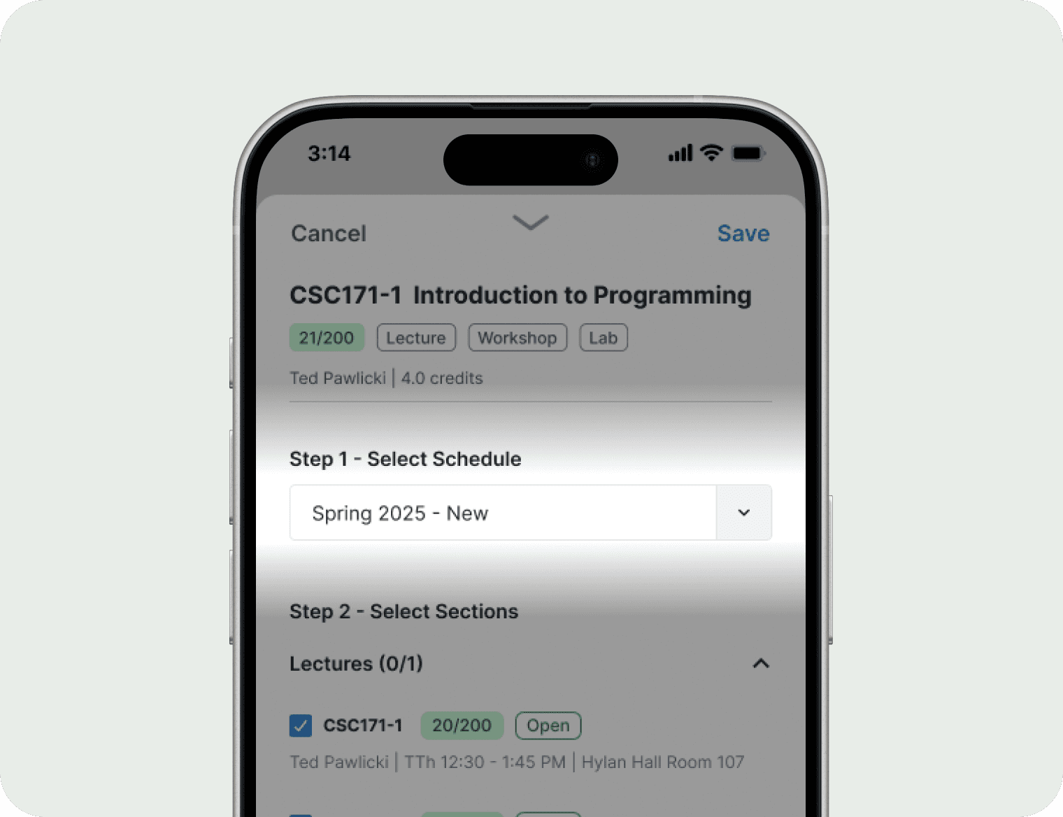
ITERATION 02
Recognition over recall
Their feedback made sense. This highlighted a recognition-over-recall issue.
Users aren’t thinking about schedule selection when reading through courses. So I moved the dropdown off the search page into the course adding flow. When the user hits the plus button, the dropdown appears as a step before choosing course sections. This way, users first find a class, then select which schedule they want to place it in.
Before
After
ITERATION 02
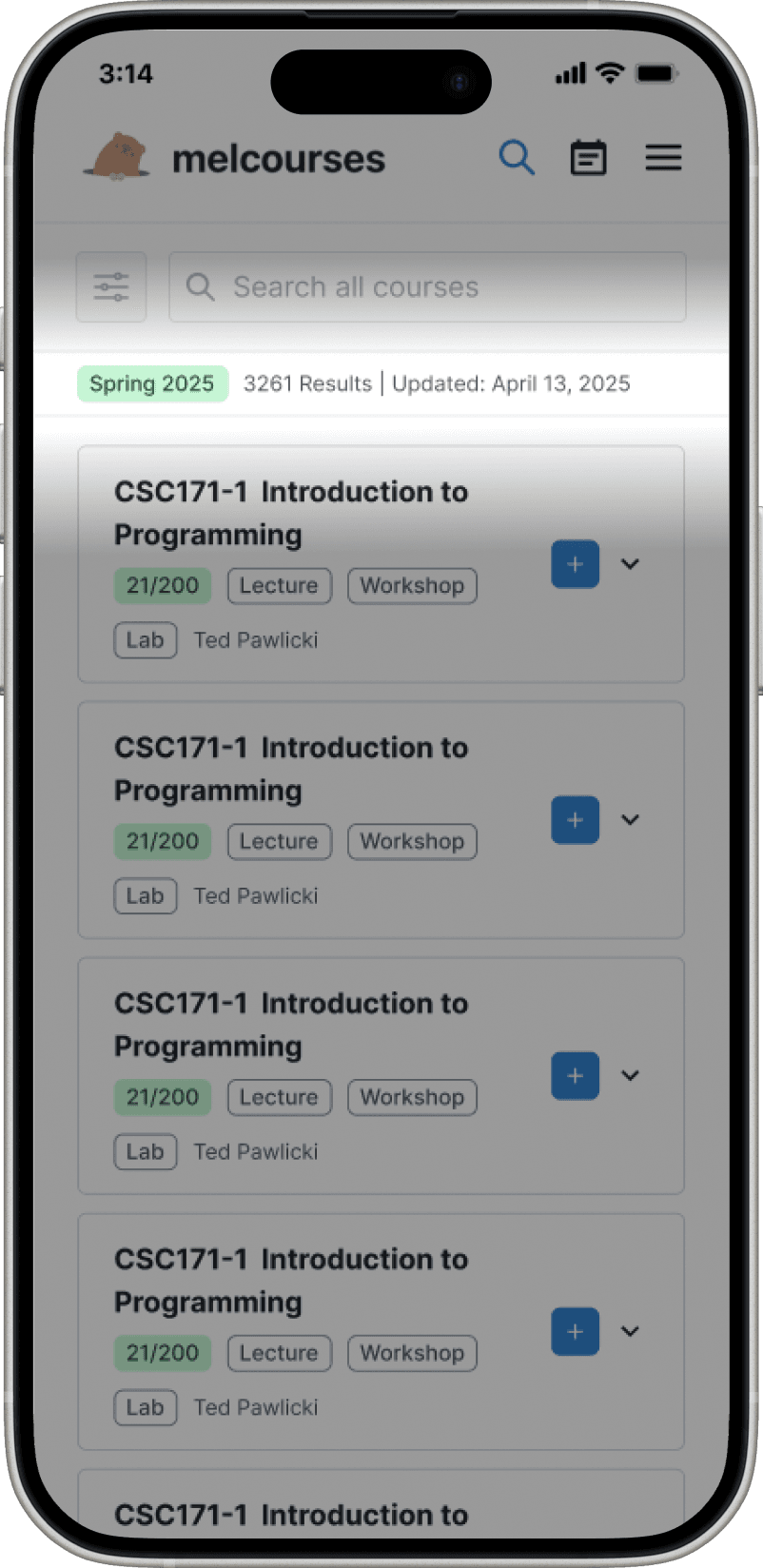
New Signifiers & Feedback
Term Tag
Different classes are offered in Fall and Spring term
Without the dropdown at the top, you can't tell which semester you're searching in
Added a tag to show the current term (orange for Fall, green for Spring)
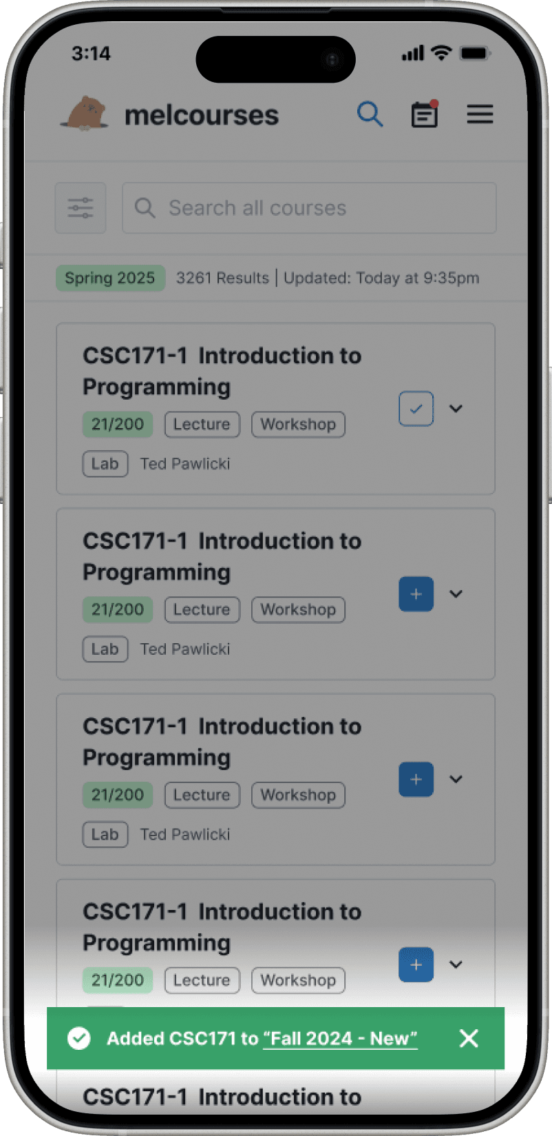
Confirmation alert
Without a sidebar showing added courses, users had no feedback that a course was successfully added.
I added a confirmation alert with a link to view the course directly in the calendar.
TESTING
8 Usability Tests
After finalizing the final design, I had four days left to validate it before handoff. The UX team and I conducted 8 usability tests, focusing on finding courses, sharing plans, and editing schedules on mobile.
Tasks
Navigate between the schedule and search page
Create new schedule
Search for a course and add it to a schedule
Change course sections for a schedule
Deleting a course from a schedule
92.5%
Task success rate
4.6/5
Ease rating (Likert scale)
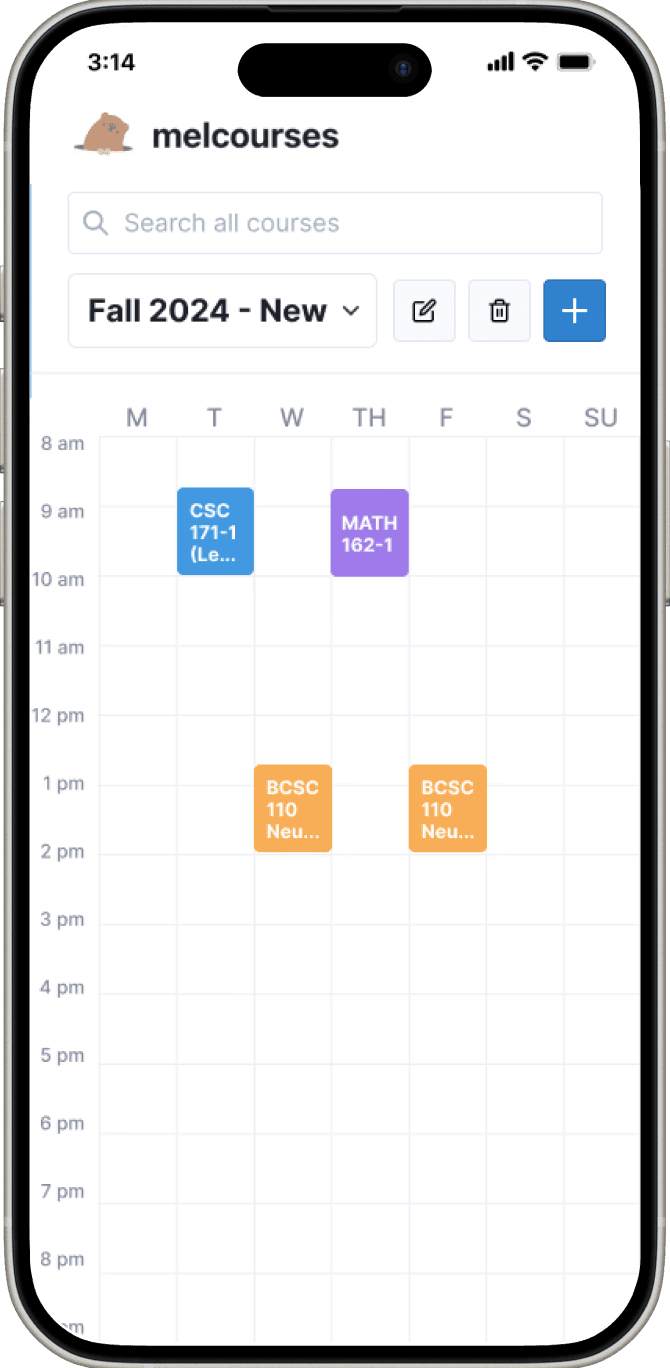
SOLUTION
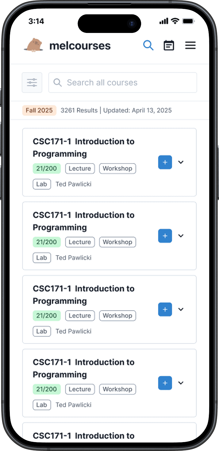
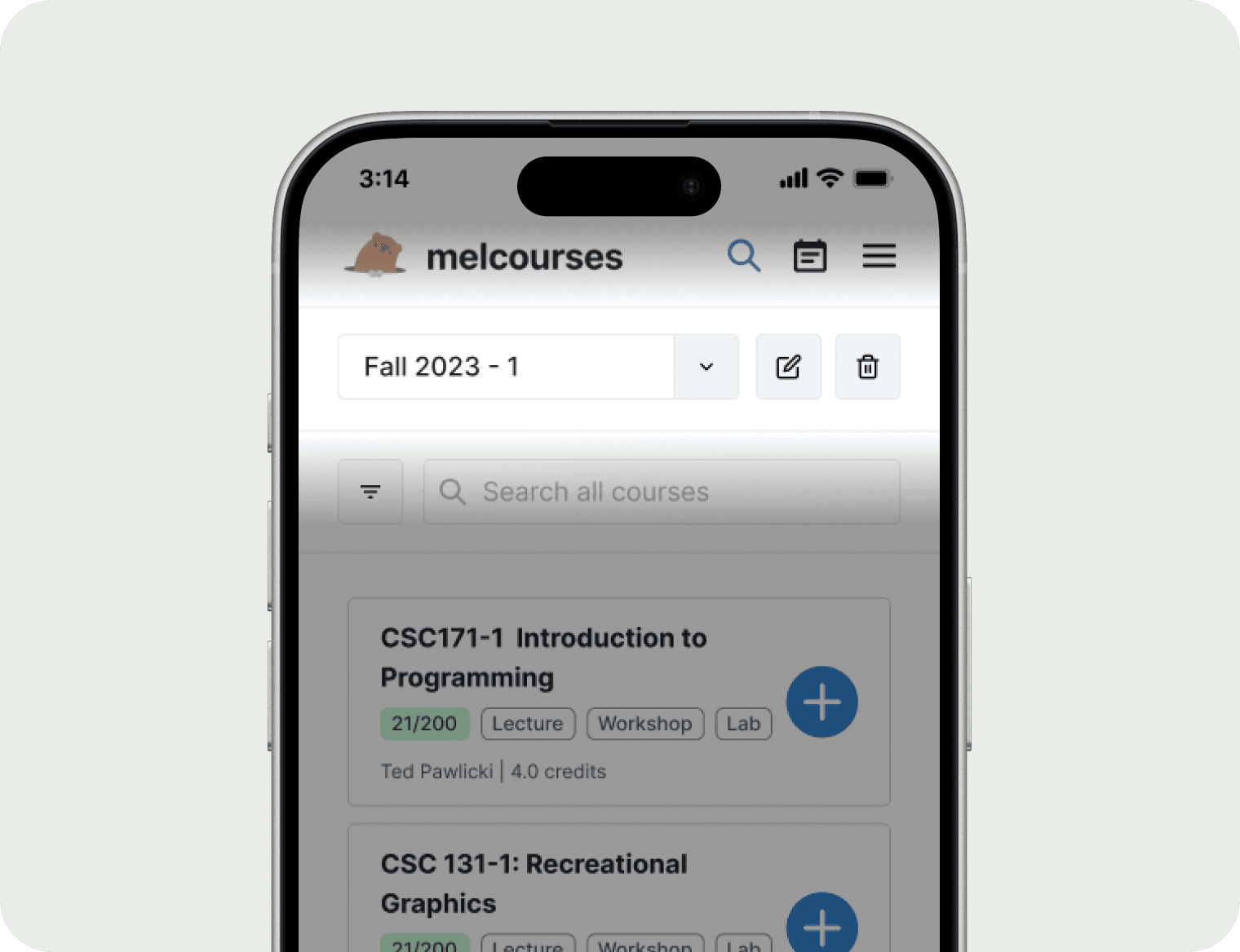
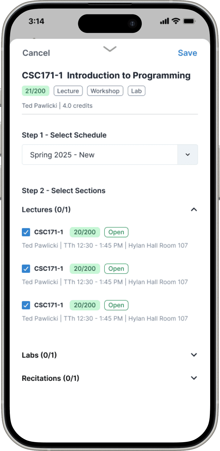
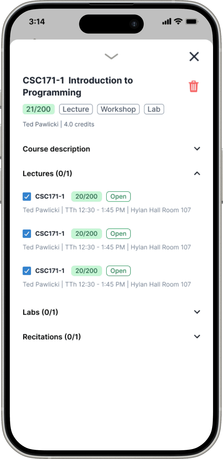
Search Page
Course cards can be expanded to be read
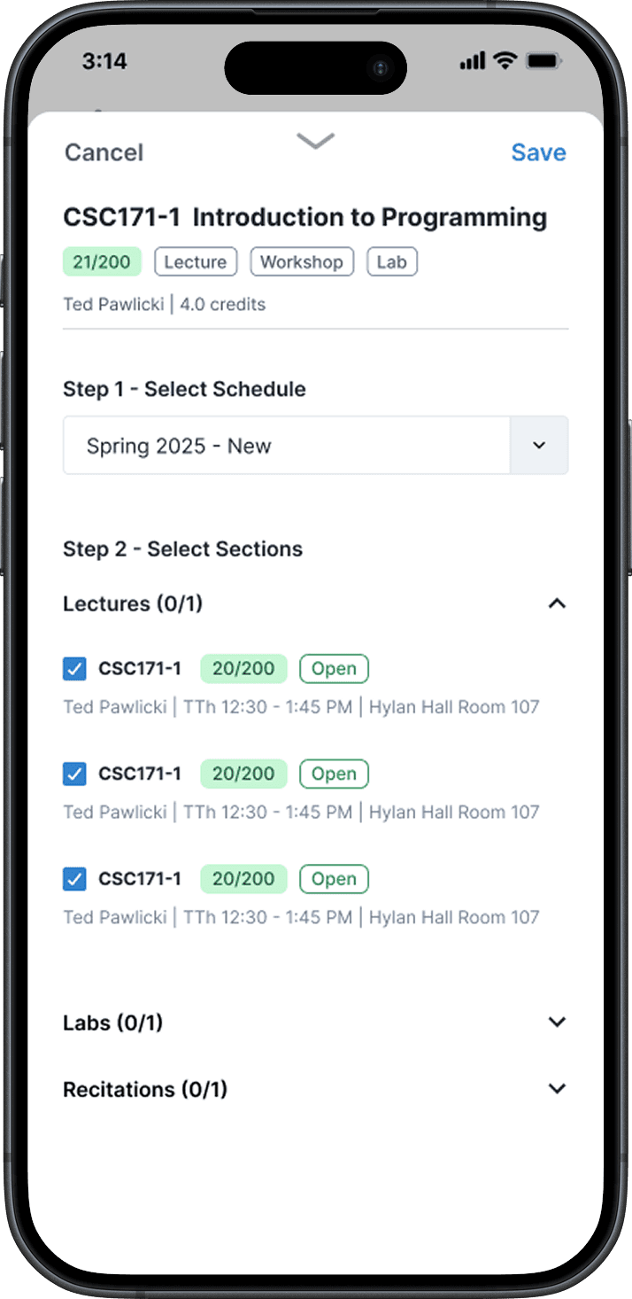
Multi-step modal lets users select schedule and sections
Confirmation message provides feedback that the action was successful

SOLUTION
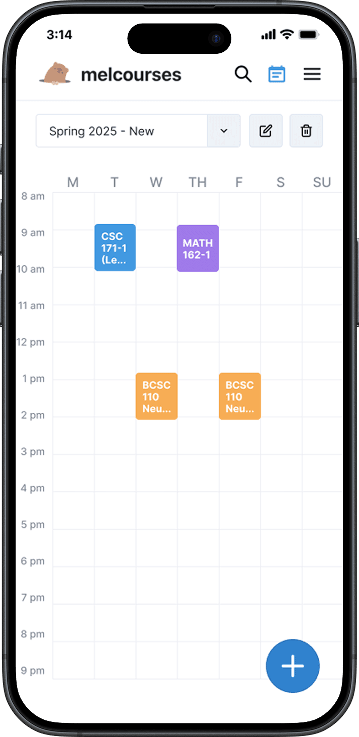
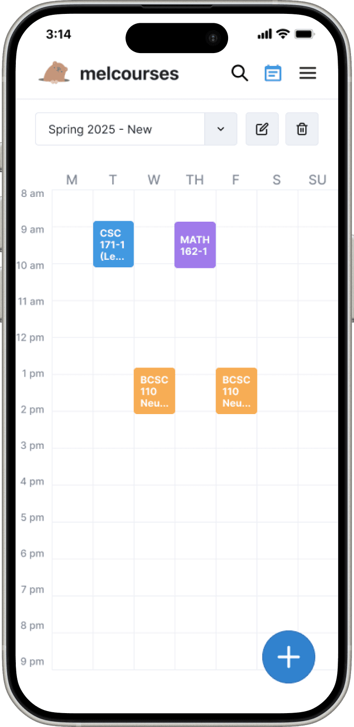
Schedule Page
User Goal - Adjust & Share
Visual schedule is what you see first, for shareability
Clicking on a course lets you select section times, using a swipe-able drawer so the visual schedule can be referenced without breaking flow
RESULTS
Impact
For the remainder of the time until course registration, I worked closely with developers to ensure the design was implemented accurately. The mobile design, along with other UX improvements, launched during Fall 2024 course registration and helped drive these results.
~20%
of the UofR undergraduate population used Melcourses this cycle
53.8%
increase in peak monthly active users
Earned official University endorsement as a course planning resource for students
RESULTS
Reflections
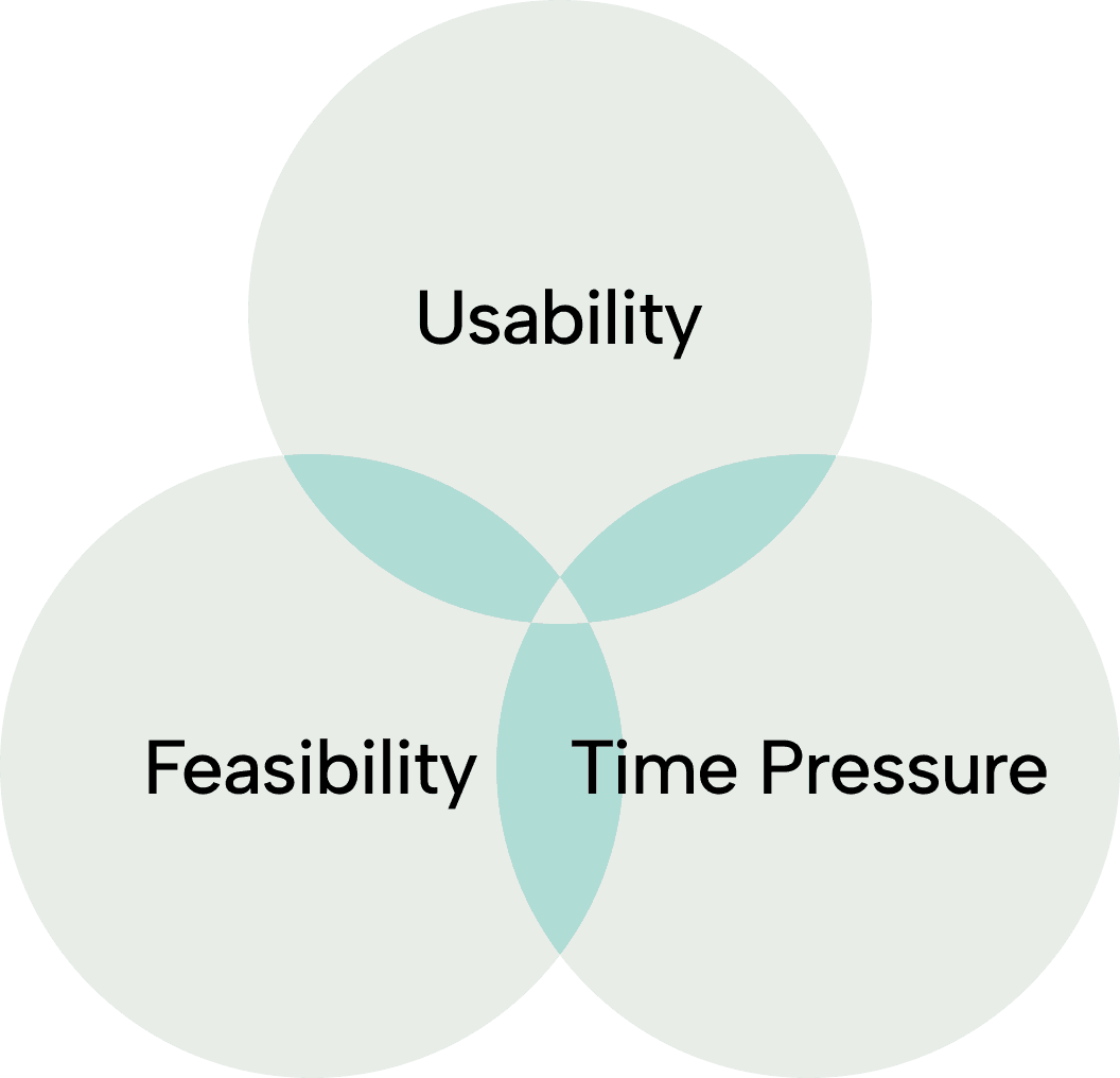
Divergent ideation is useful, even under time pressure
Despite the tight timeline, I decided to create explorations rather than choosing one design direction. As a result, the team was able to piece together a design that balanced all of the usability v.s. feasibility tradeoffs. Putting out lots of ideas, regardless of quality, provides tangible work to analyze and learn from. Every iteration is a lesson that informs the final design.
Communicate early about feasibility
Early communication with the team was critical. Without checking in at the start, I could have gone too far down one direction and risked designs that couldn't be implemented on time.
Ground decisions in data
Given the time constraints, I wasn’t able to conduct as much user research as I would have liked. If I could do one thing differently, I'd dive deeper through surveys and interviews to fully understand the need for mobile. This experience reinforced my belief that design decisions should always be grounded in concrete data.
© Kyle Jhong 2025
